JMG Seafood Company
Brand Development

Meet the Company
JMG Seafood Company is a new seafood distributor in Tampa, Florida. Due to their location, they requested a “fun, retro, 80’s vibe” to match the Florida beach aesthetic.
The Brand Creation
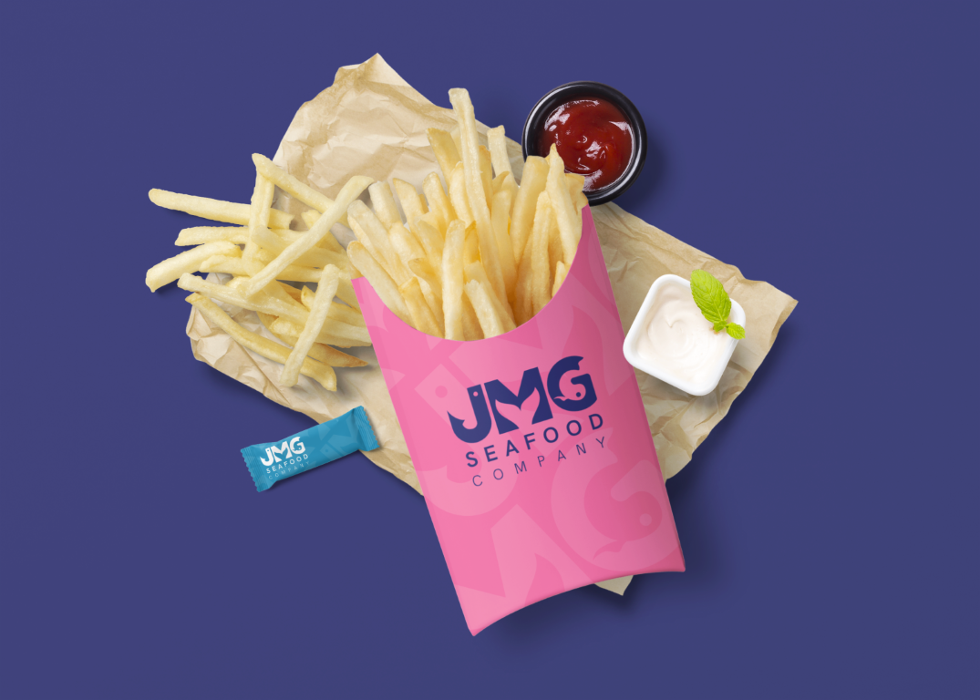
Basing our concept off Miami Vice intro screens (yes really!) we first selected a bright, 80’s-evocative color palette. These bold colors would be striking on product packaging, as well as attention-grabbing in digital representations.
Because the client wanted a fun logo, we used sea iconography as a modern contrast to the 80s color palette. The J was transformed into a fishing hook, a whale tail was incorporated into the negative space in the M, and a swimming fish transforms the counter in the G.
Finally, we married the logomark and color palette in a variety of real-world scenarios, including packaging and stationery.
Conclusion
Through the use of bold color and modern, negative space design, we branded JMG seafood into a fun, edgy, Florida-aesthetic distributor.
Project Scope
- Brand Identity Concept
- Logo Creation
- Brand Standards
- Brand Collateral
- Stationery
- Color Palette
- Typography
- Asset Creation
Roles
- Graphic Designer


