
CMYK, RGB, WTAF?
Understanding Color Spaces in Design
Color spaces sound like something out of a sci-fi movie, but if you’ve ever sent a logo to print and it came back looking “off,” you’ve already met their wrath. Here’s what every small business owner (and honestly, every designer’s client) needs to know to keep their brand looking sharp, both on screen and in print.
The Two Main Color Worlds
Stands for: Red, Green, Blue
Where you see it: Websites, social media, anything that glows from behind (your phone, your laptop, a Times Square billboard)
How it works: Colors are created by mixing light. More light = brighter colors. All three at 100% = white.
Why it matters: RGB can show millions of colors—some super-vibrant shades you just can’t get in print.
Stands for: Cyan, Magenta, Yellow, Key (Black)
Where you see it: Magazines, business cards, flyers, product packaging—anything physically printed
How it works: Colors are made by layering ink. More ink = darker colors. All four at 100% = a deep, rich black (ideally).
Why it matters: CMYK’s color range is smaller than RGB. Some bright RGB colors (think neon blues or electric greens) just aren’t possible on paper.
Enter Pantone: The Color Control Freak
If you want your brand’s colors to look exactly the same every time—no matter who’s printing them, or what country you’re in—Pantone is your best friend.
Pantone (PMS):
What is it? A universal color-matching system. Think of it as the “paint swatch” book for printers.
Why use it? Pantone inks are pre-mixed, so you get the same color every time, everywhere. This is how Coca-Cola red or Tiffany blue always look perfect.
When to use: Logos, brand colors, or anything where color consistency is mission-critical.
Coated vs. Uncoated: Why Pantone Looks Different on Different Papers
Coated Paper (C)
Glossy, smooth, and shiny—think magazine covers. Pantone colors printed here look brighter and more vibrant because the ink sits on top of the coating.
Uncoated Paper (U)
Matte, textured, and absorbent—think stationery or letterhead. Pantone colors here look softer, sometimes duller, because the ink soaks into the paper.
If you specify Pantone 300C (coated) for your business card and Pantone 300U (uncoated) for your letterhead, they’re technically the “same” color, but they will look a bit different in real life. That’s just physics—paper absorbs ink differently!
Pro Tip:
Always check Pantone swatches on the actual paper type you’re printing on. Ask your designer or printer for a physical proof if you want to be 100% sure.
Let's Get Geeky now...
gamut (noun):
The complete range or scope of something. In design and printing, “gamut” refers specifically to the full range of colors that can be reproduced by a particular device or within a specific color space, such as RGB, CMYK, or Pantone.
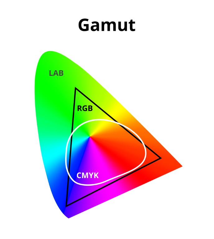
When designers talk about “gamut,” they’re simply referring to the full range of colors that a particular color space (like RGB, CMYK, or Pantone) can produce. Think of it as the total palette available to you in each world. RGB, which is used for screens, has a much wider gamut—meaning it can display more vibrant and intense colors, including those ultra-bright neons and deep blues you see on your phone or laptop. CMYK, on the other hand, has a more limited gamut, so some of those eye-popping digital colors just aren’t possible when you move to ink and paper.
This is why a color that looks electric on your website might appear dull or muted when printed. It’s not your printer’s fault—it’s just that the CMYK “world” doesn’t have access to the same set of crayons as RGB. Pantone spot colors are designed to fill in some of those gaps, offering specific shades you can’t get with regular CMYK inks, but even Pantone has its limits. Understanding gamut helps you set realistic expectations for your brand’s colors, so you’re never surprised by the difference between what you see on screen and what comes back from the print shop.
Why Color Spaces Trip People Up
You design a graphic on your computer (RGB)
It looks amazing—vivid teal, hot pink, pure black.
You send it to print (CMYK or Pantone)
Suddenly, the teal is dull, the pink is muddy, and the black looks… not quite black
WTAF just Happened?!
The printer had to “translate” your colors from the RGB world to the CMYK or Pantone world, and some colors just don’t survive the journey.
Common Client Questions (and Straight Answers)
Why do my colors look different on paper?
Screens and printers speak different “color languages.” RGB is like high-def TV; CMYK and Pantone are like real-life paint. They’ll never match 100%.
Can’t you just make my print look exactly like my screen?
Not always. Some colors simply can’t be printed. But a good designer (hi! 👋) will adjust your files so your brand looks its best in both worlds.
Why does my Pantone color look different on my business card vs. my letterhead?
Because one’s on coated paper and the other’s on uncoated! The same ink reacts differently to different surfaces.
TL;Dr
- RGB = for screens. CMYK = for print. Pantone = for perfect color matching (especially for logos).
- Colors won’t always match—plan ahead.
- Coated and uncoated papers make Pantone colors look different.
- A little color know-how saves a lot of headaches (and reprints).